


THE PURPOSE
To create and deploy a design system to align with 3-4 internal tools designed and built by individual product teams.
Wemo Design System


Case Place
Team of 12

Pricing Tool
Team of 11

Nigel
Team of 8
What problems we're we solving?

Consolidating Styles
Convert all styles into a single style by addressing primitives first, address semantic styles, and tie them all together using variables.

Eliminate Custom & Embedded Components
Find and convert all one-off custom or embedded elements that are not componentized.

Component Framework Alignment
Select a UI framework such as Material or Mantime that all teams can agree on.

Reduce Time & Resources
Minimize the effort for designers and engineers to build out experiences from scratch.
THE RESEARCH
How do I determine a design system framework that works best for users?
To engage with my users, I jumped into researching UI frameworks and design systems to make onboarding and gaining support from my audience as easy as possible when it came to naming and organizing things. So I put my nose to the books (using Google, YouTube and Figma Community) and started doing some research to gather insights.
My focus was on three key aspects
-
Popularity
-
Usability
-
Commonality
Some of the key areas I focused on during the initial setup in Figma.
ORGANIZE
Identify a hierarchy to organize the Figma file to match common UI Component Libraries and Design Systems.

NAMING
Name each component, component parts and variants to reduce ambiguity and findability.

PROPERTIES
Break down each component into so that their properties are mostly binary, giving them all easy access to adjust.
Planning a phased approach in order to minimize issues.
Mockups
To help establish styles using a reference
Foundational Variants
Create colors, gradients, typography, elevations and border radius styles
Spacing & Grids
Define spacing values and responsive grid types
Complex Components
Create complex components such as date time picker and modals
Figma Setup
Create a Figma file with necessary page structure
Semantic Variants
Connect foundational colors and type to corresponding uses
Basic Components
Create components that require alignment such as buttons and text fields
Patterns
Define common layout use cases that can be templatized
THE FOUNDATION
Using variables in our design system was going to minimize ambiguity and promote scalability effectively.
Variables used in the initial phase
Primitive
-
Colors
-
Font Size
-
Font Weight
-
Font Letter Spacing
-
Font Line-Height
-
Border Radius
-
Icon Weight
Semantic
-
Text Colors
-
Icon Colors
-
Surface Colors
-
Border Colors
-
Type Styles
User goals for using variables
Reduce guessing for designers on what colors, type or other properties to choose, and allow them to focus on creating the experience.
Get engineering to mirror all variants from design system to their UI component library to reduce custom and embedded code, and allow for quicker implementation.

GUIDELINES & SPECS
The guidelines provide naming conventions, variants, technical and functional specifications to help both designers and engineers create or implement with little-to-no ambiguity. For engineers, it helps to establish the initial creation of an application and only requires updates when the design system manager posts a new version.


FIGMA COMPONENTS & PROPERTY SETUP
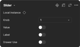
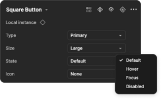
In addition to providing a guideline that has contextual value, it's kind of useful to create the backbone to crafting design solutions using components created within Figma. When designing these components, I had to carefully consider how to structure the properties into prompts to allow designers to understand how to change the property (eg. change a button state to hover). It's essentially building a user experience in Figma for the design system... for user experience designers.
Avatar Status (Avatar + Status Dot)
Component
Property Menu
Button
Component
Property Menu

Slider
Component
Property Menu